Logistics affect decisions.
Sometimes that vertical VS horizontal issue is determined by the logistics of the environment. For example, if the teacher wants to use the chalkboard ledge to stand up the schedule pictures, the display will have to be horizontal. A picture strip posted on the bathroom wall may need to be vertical because of the limited space.
Clearly define the beginning.
What may be more important than vertical VS horizontal is making it very clear where the student should look first. I have seen visual displays that were randomly put up with no real order to them. When students have to try to figure out where to look, they probably won't benefit from the visual supports.
Summarizing the details.
I haven't seen research on these topics. If you have, please let me know. It seems that "common sense" would dictate the guidelines, but everyone doesn't have the same common sense. Each child and each environment may require different decisions. So, here are some basic guidelines.
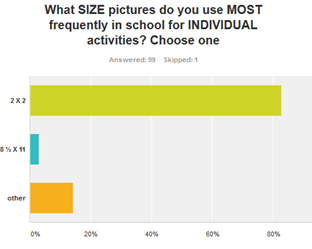
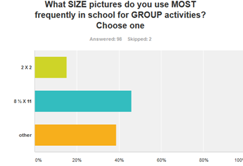
- Use larger formats when students need to see visual tools farther away.
- Smaller formats generally work for individual visual tools.
- Younger or lower skilled students generally need larger formats than older or higher skilled students.
- Vertical and horizontal formats can both work but make sure it is clear where to start.
And one more thing. . .
If you create a visual tool and it works. . . .smile. If you have a visual tool that isn't accomplishing what you want, look at what needs tweaking. It is a bit like the story of Goldilocks. Remember her?


No comments:
Post a Comment